
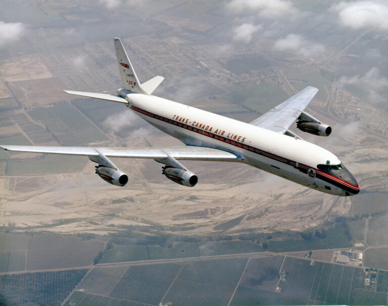
As 2025 marks the 60th anniversary of Air Canada’s iconic Rondelle logo, it’s an ideal moment to reflect on the rich history behind one of Canada’s most recognizable symbols in aviation. First introduced in 1965, the Rondelle logo quickly became synonymous with excellence in air travel, both in Canada and across the globe.
The logo, with its stylized maple leaf at the center, was designed to represent Air Canada’s Canadian roots, showcasing national pride while emphasizing the airline’s global reach. The use of the red and white colors was carefully chosen to reflect the flag of Canada, reinforcing Air Canada’s role as the country’s official international carrier.
Over the decades, the Rondelle has evolved, undergoing subtle updates to reflect modern design trends. Yet, the spirit of the original logo remains intact focusing on simplicity, elegance, and the unshakable connection to the Canadian identity. The continuity of the Rondelle has been a testament to Air Canada’s dedication to its values: heritage, quality, and service.
Today, the Rondelle is more than just a logo. It is a symbol of Air Canada’s resilience and commitment to offering passengers exceptional travel experiences. From humble beginnings to becoming one of the largest and most respected airlines in the world, Air Canada’s success has mirrored the evolution of the Rondelle itself. As it celebrates its 60th anniversary, Air Canada is not just commemorating a logo but a journey that has shaped the airline’s storied past.
The 60th anniversary of the Rondelle logo is a proud moment for Air Canada, marking a milestone in its rich history of service and innovation. It serves as a reminder of the airline’s enduring connection to its home country and the continued role it plays in connecting Canadians to the world.